
Banke
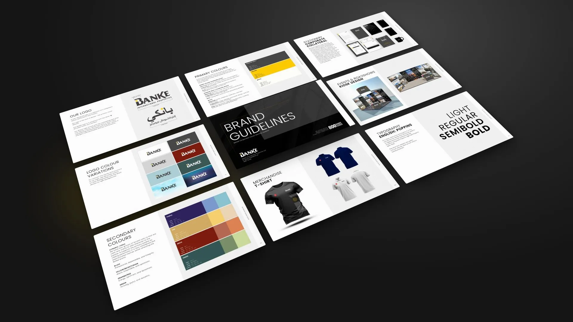
A 101-page brand guideline for Banke International Properties, a real estate company headquartered in Dubai, from strategy and logo to social media, stationery and events.
The brief
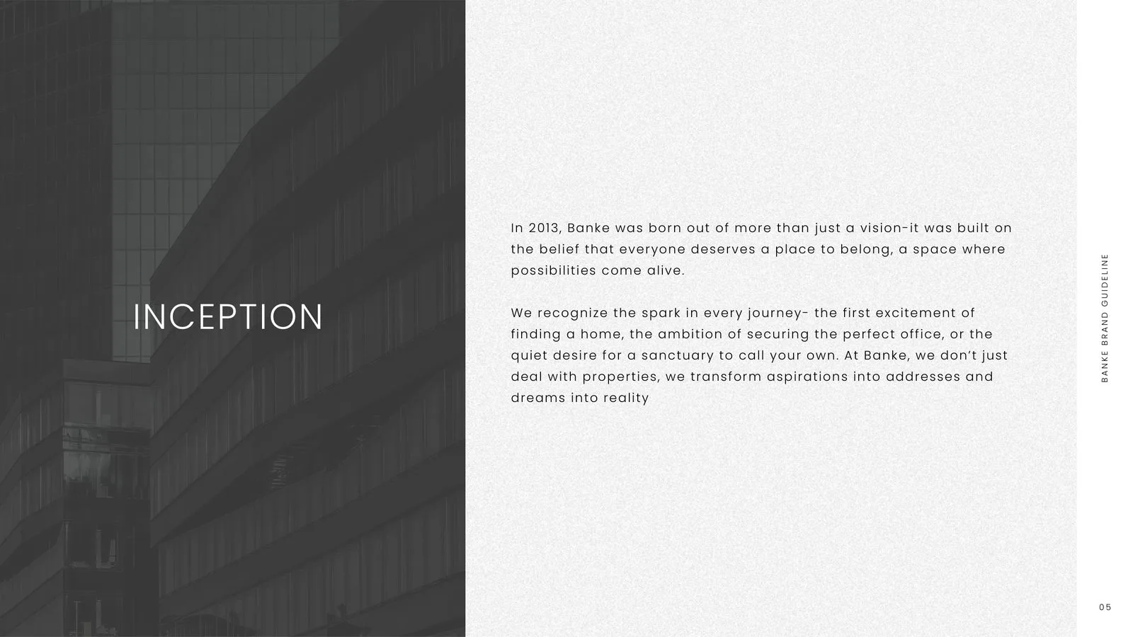
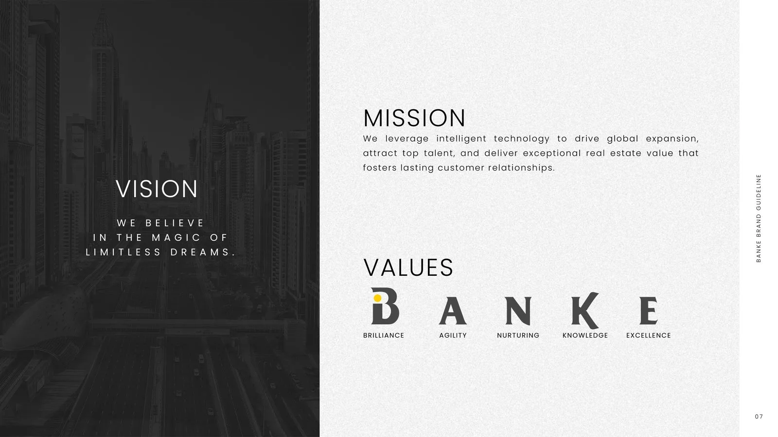
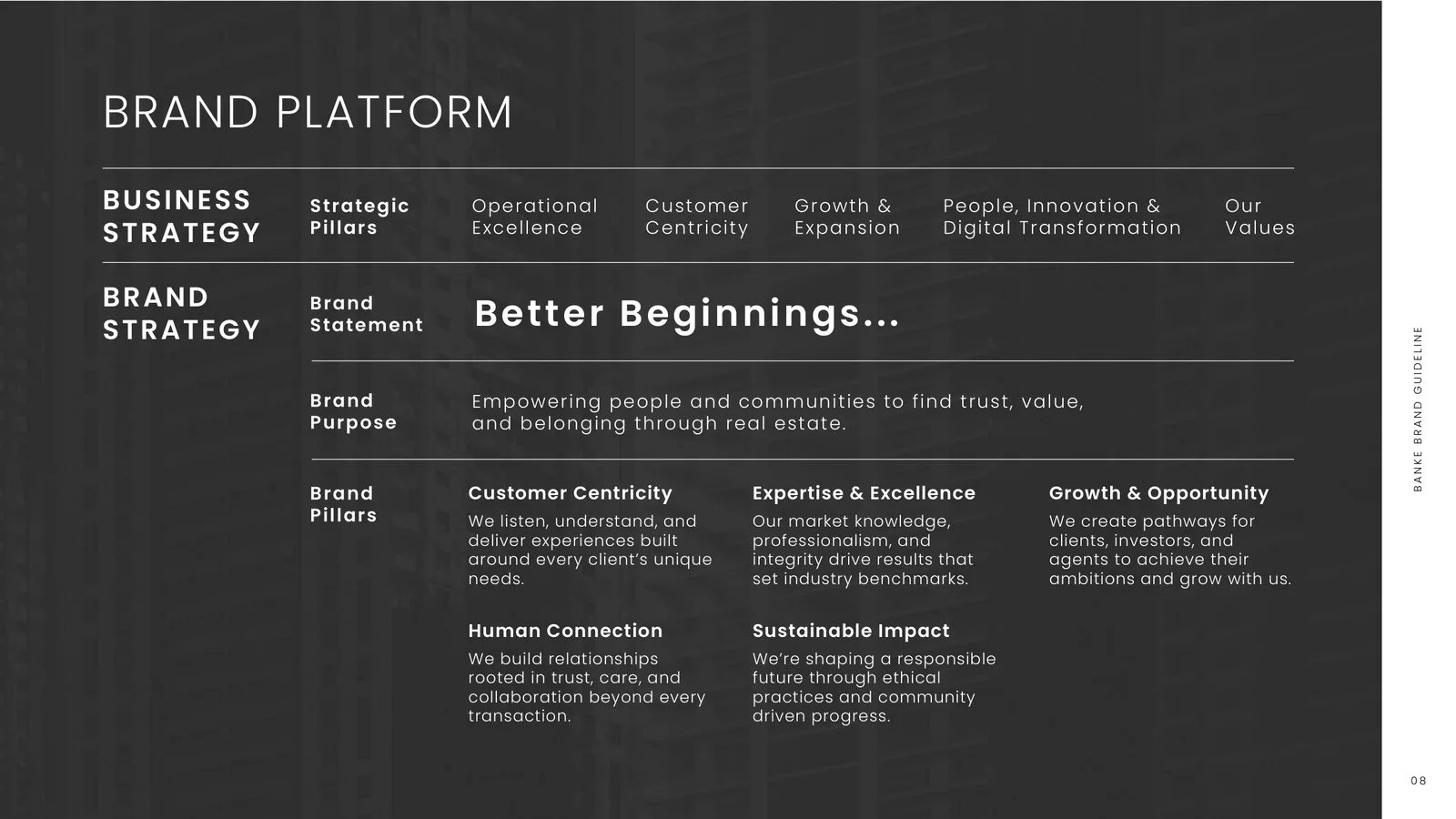
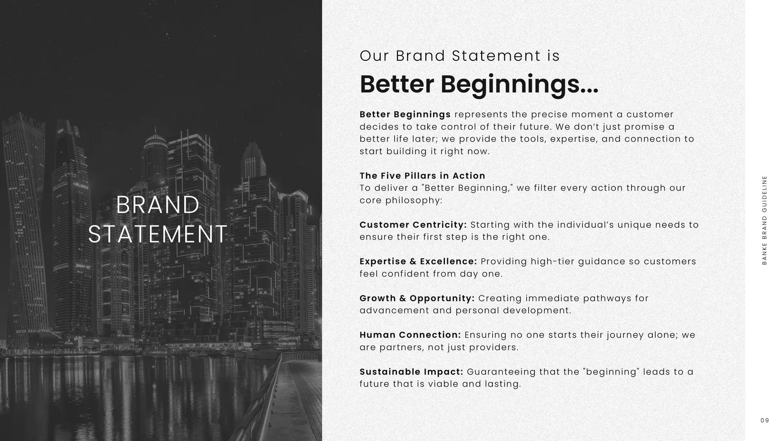
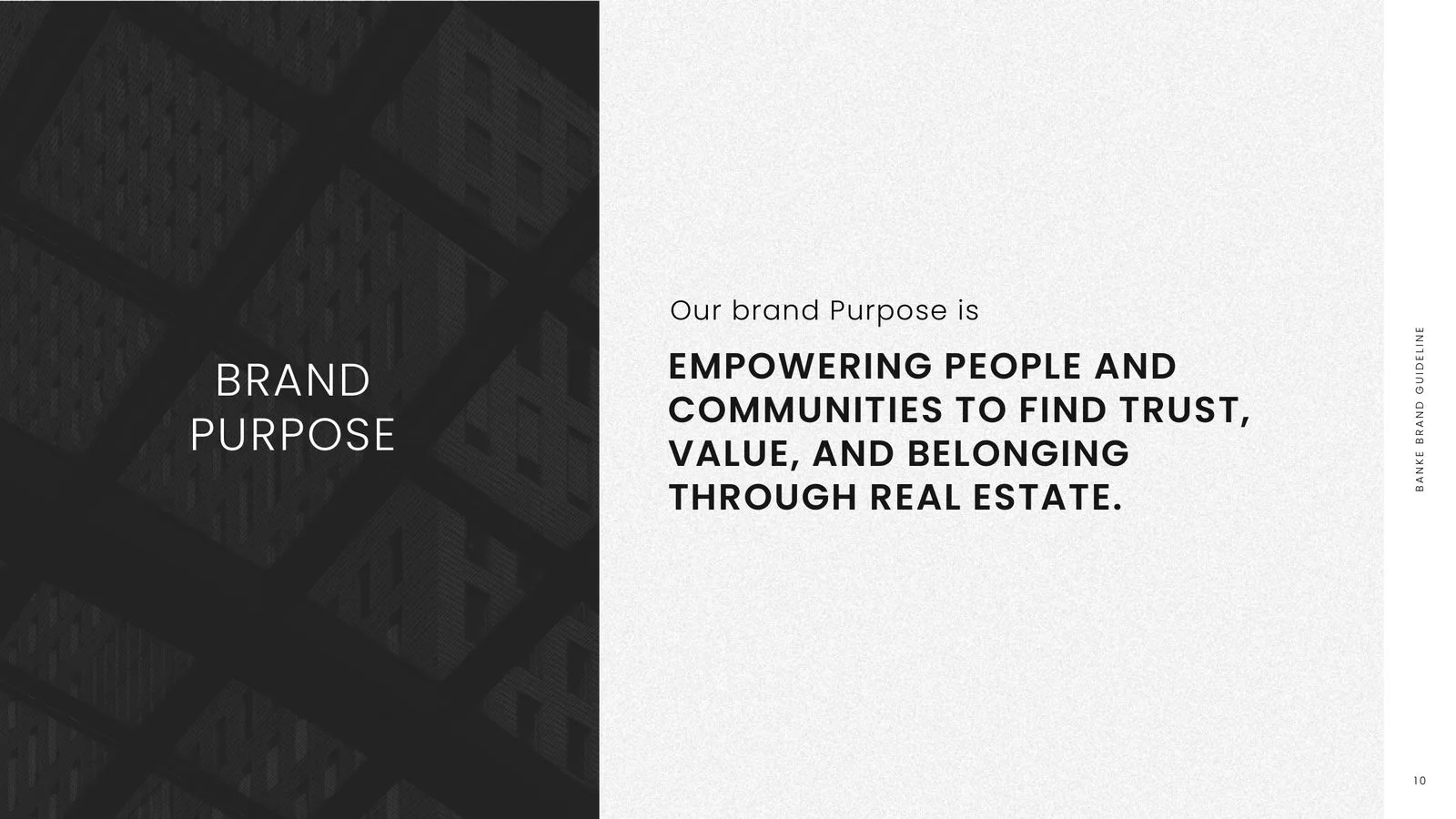
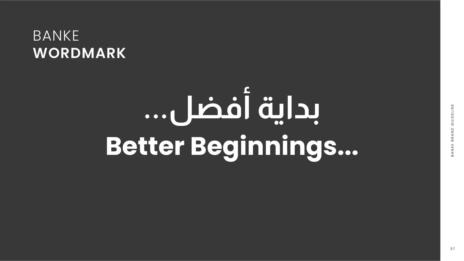
Banke International Properties has helped people buy, sell, lease and invest in property since 2013, from a head office in Dubai and offices in Qatar, the UK, India and South Africa. The guideline sets out what the brand stands for, under the line “Better Beginnings…”, and turns it into rules every team and agency can follow.
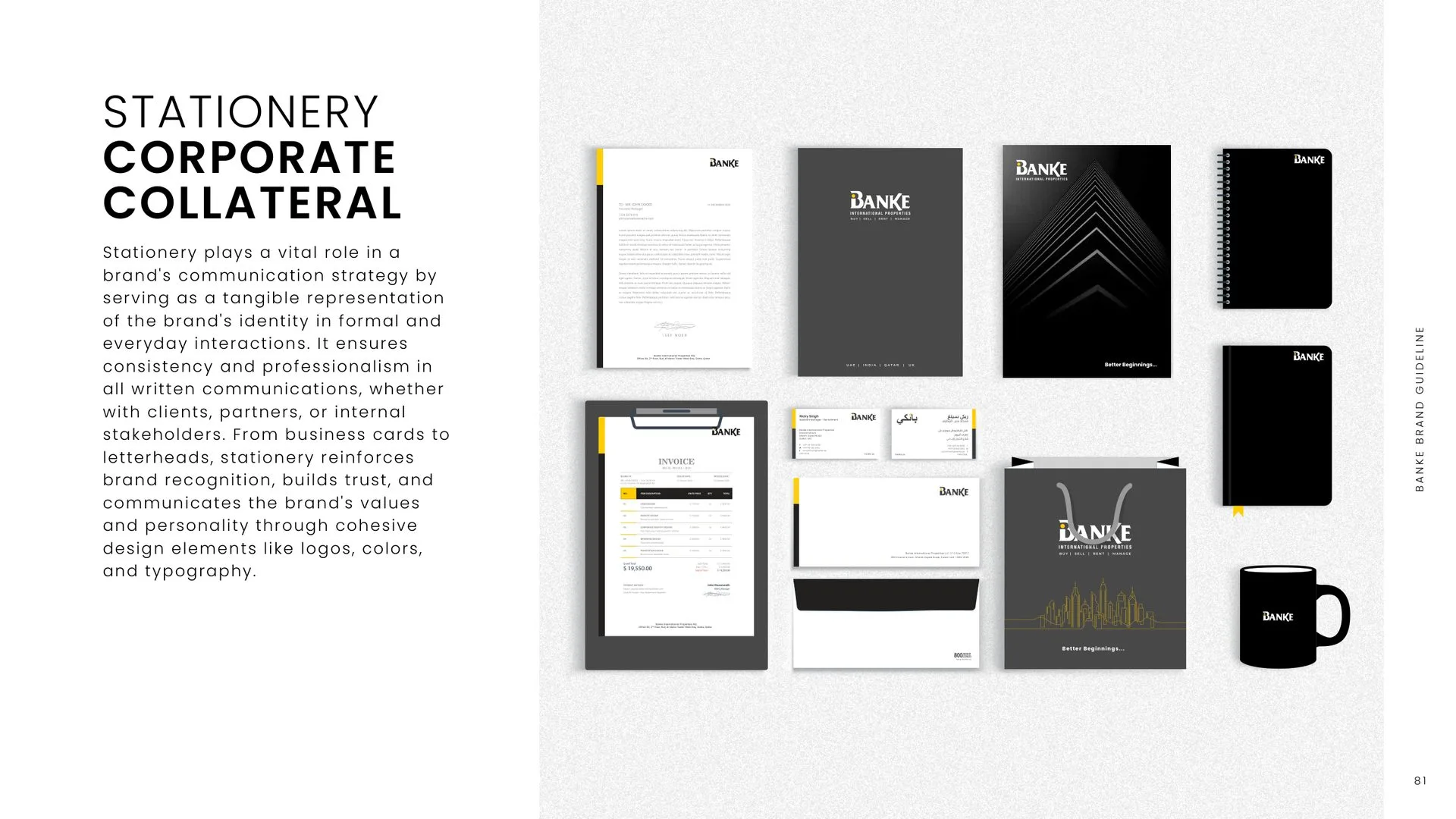
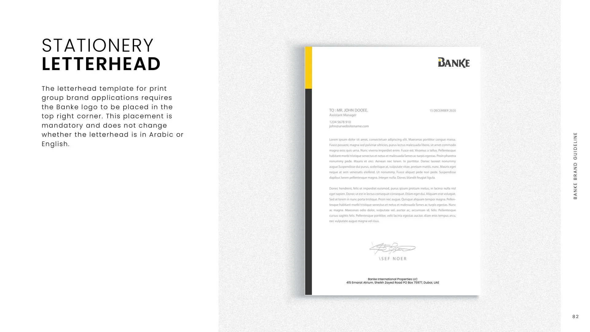
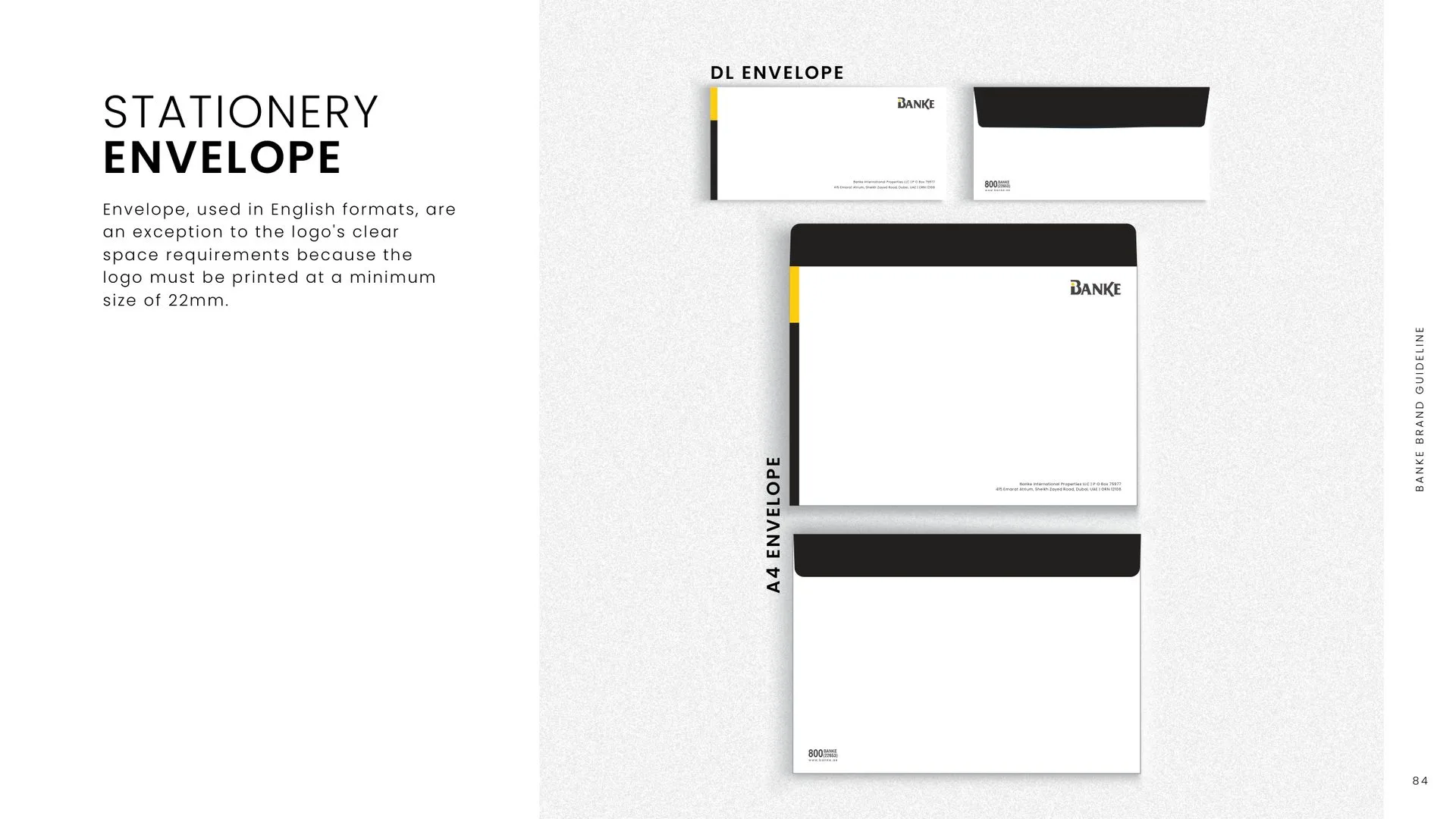
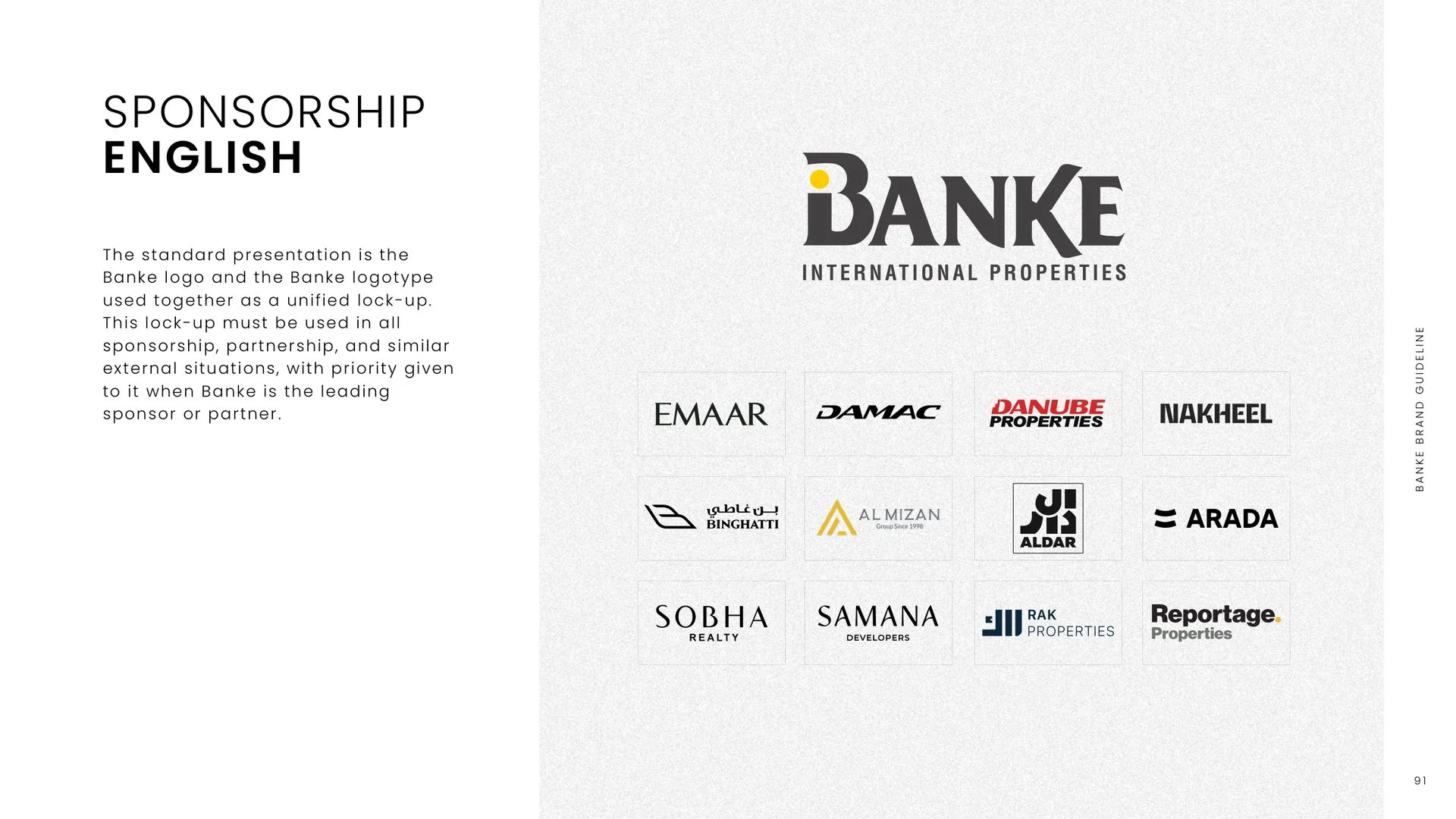
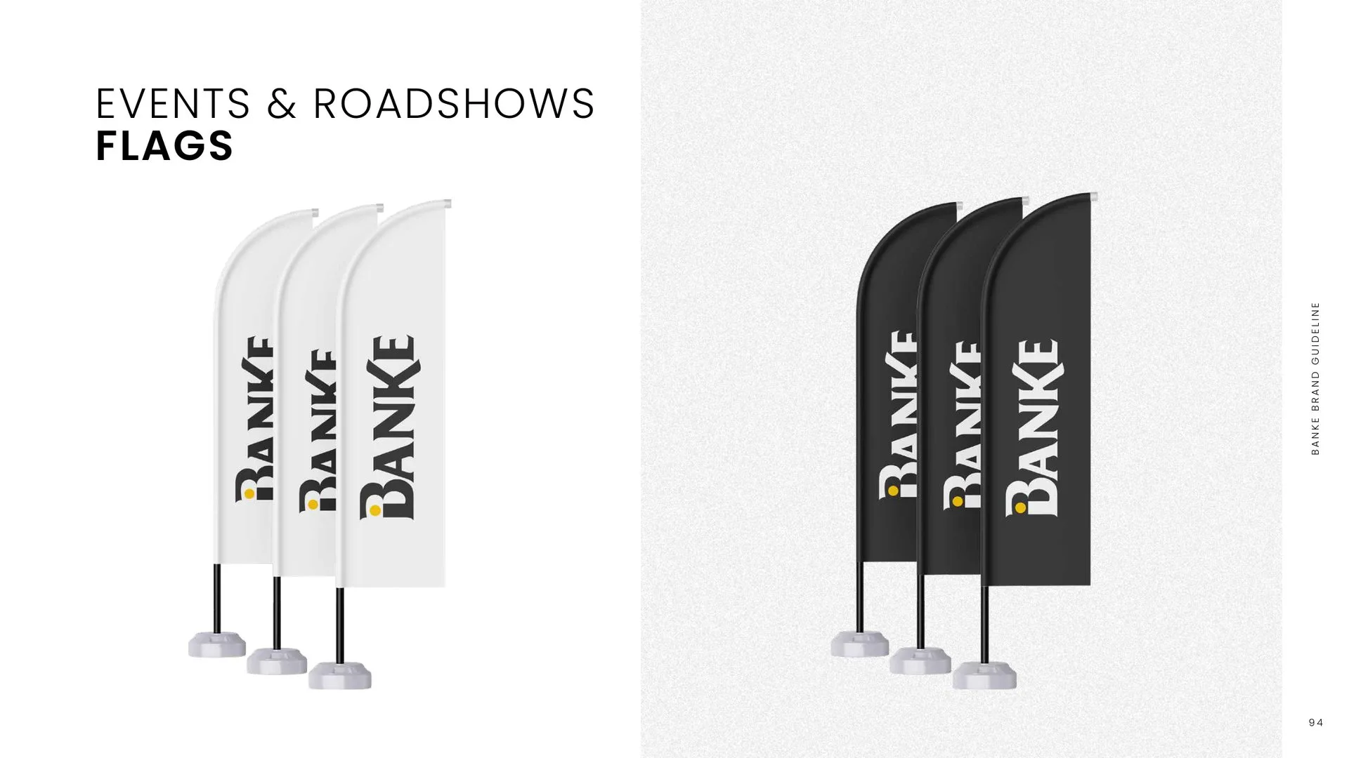
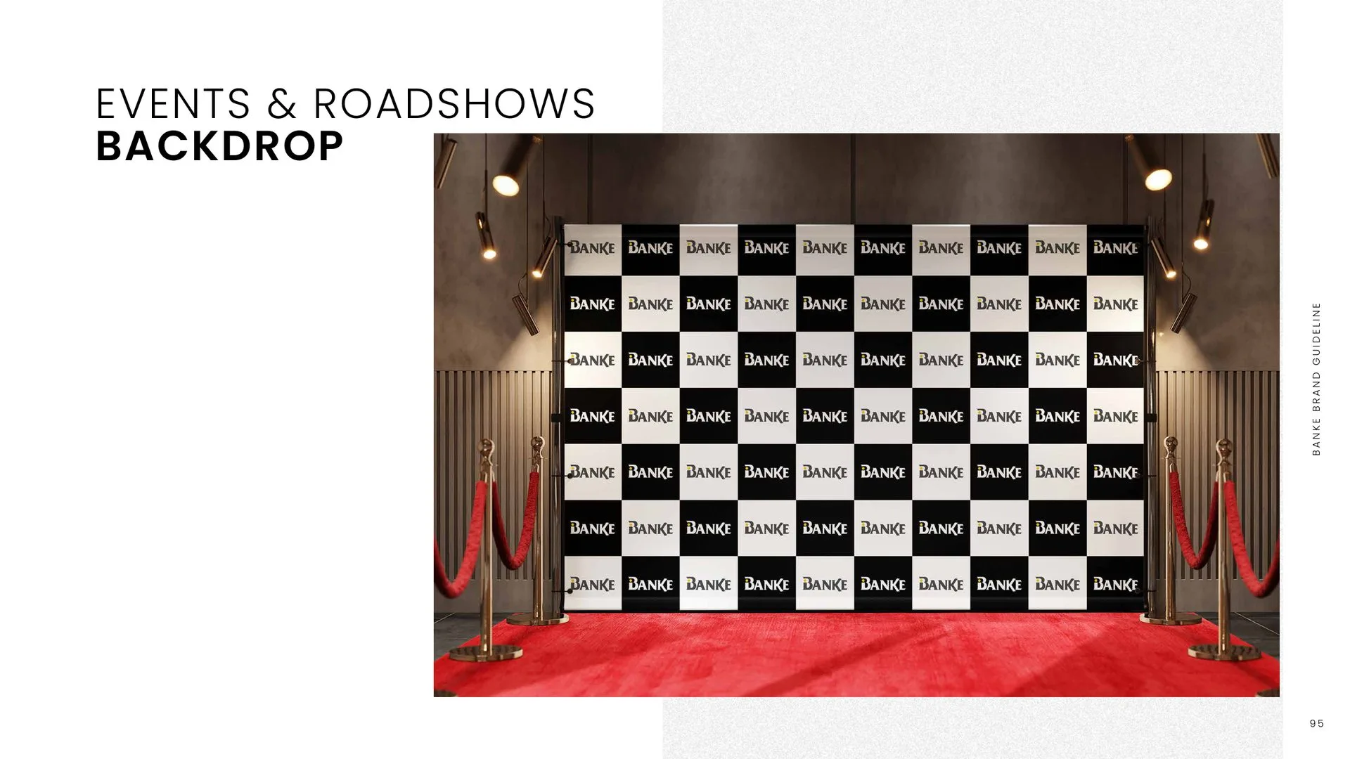
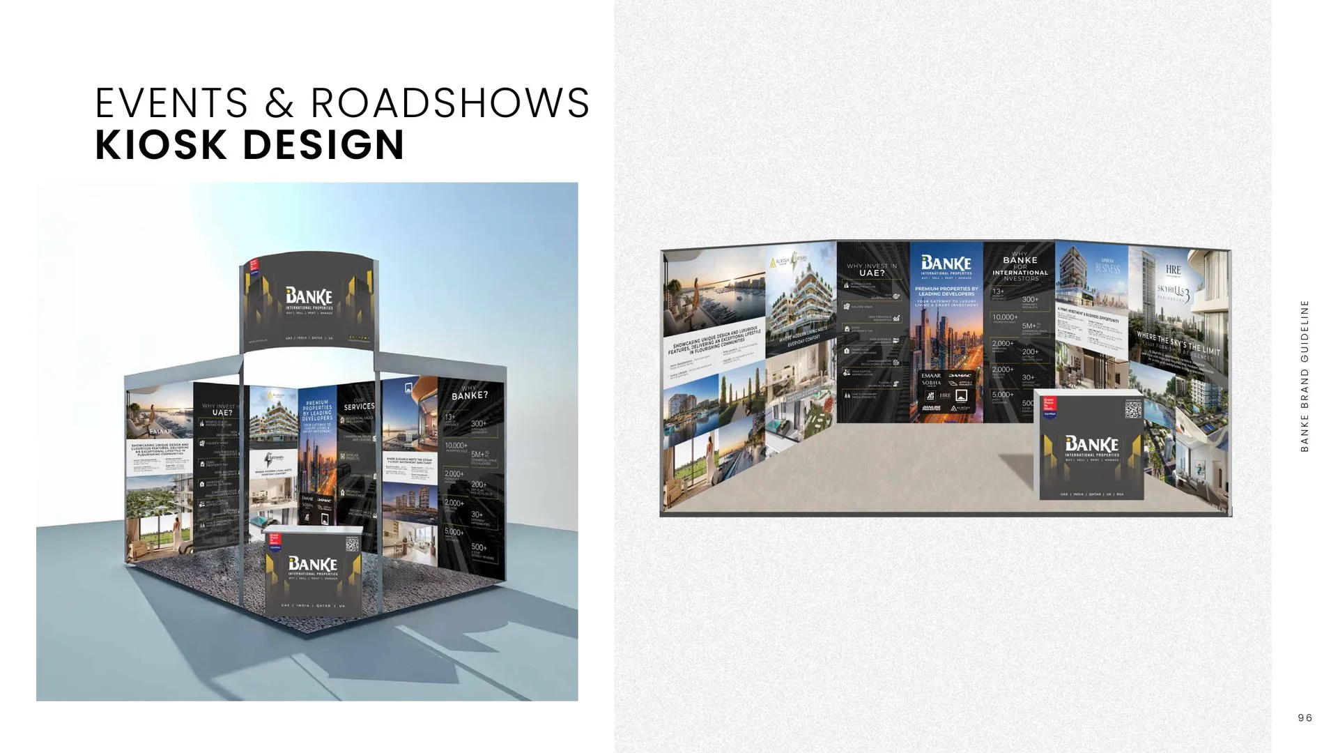
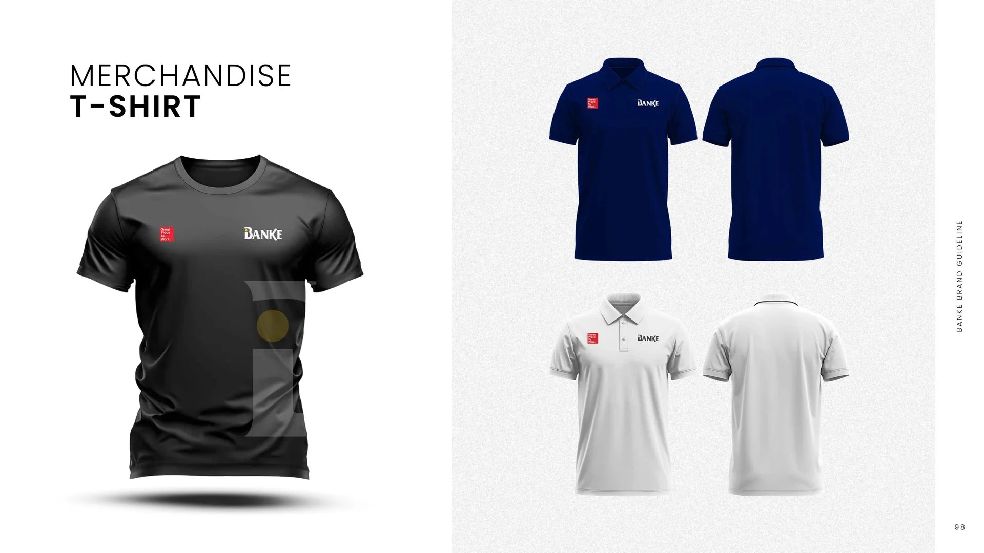
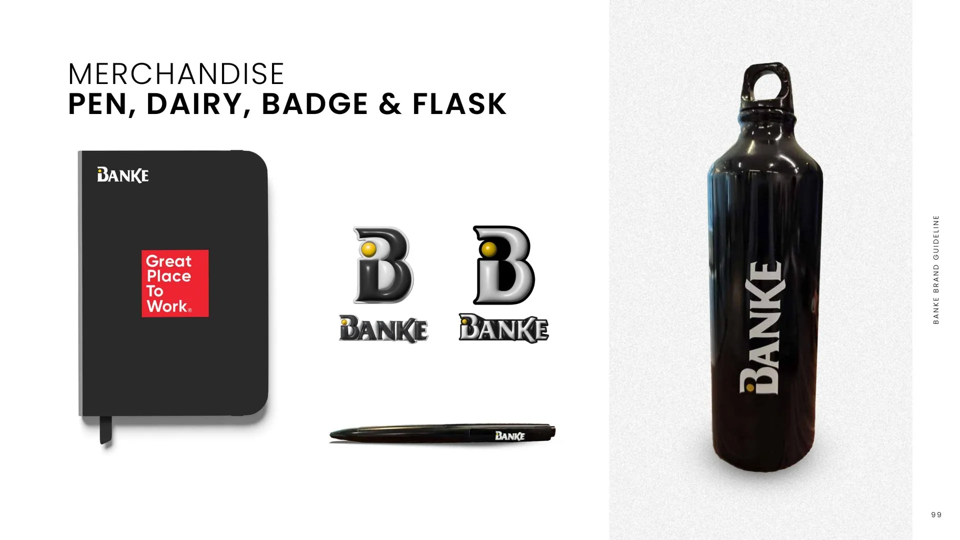
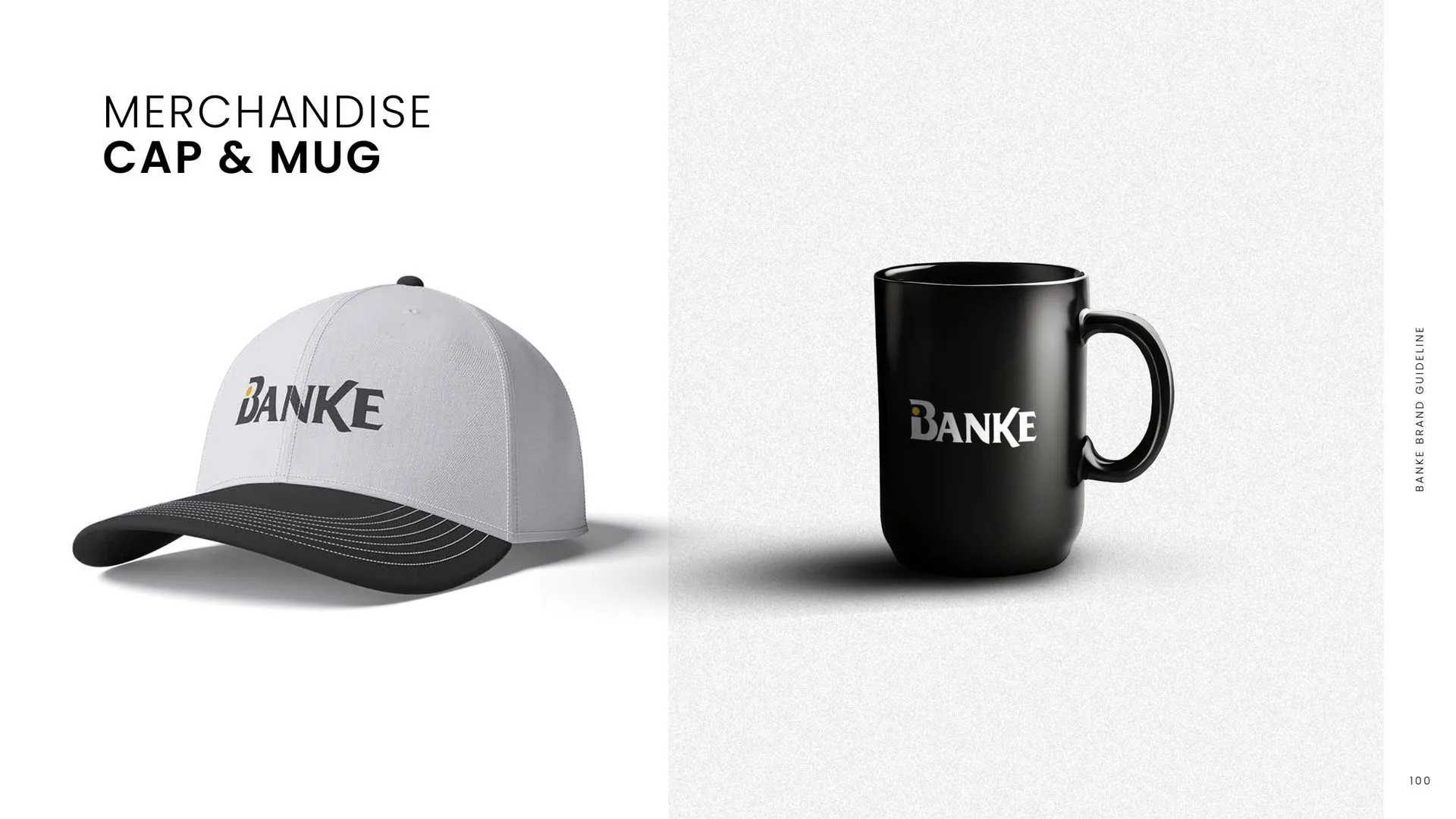
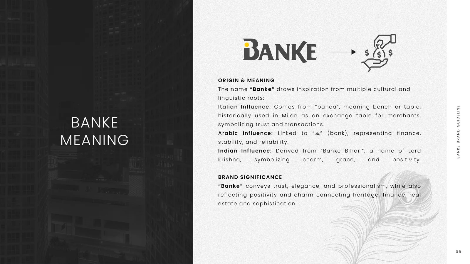
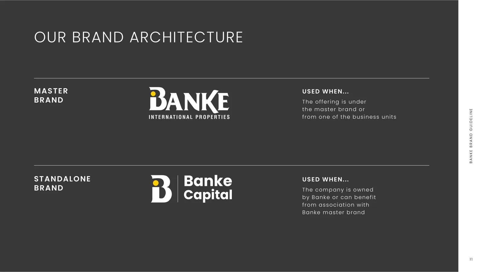
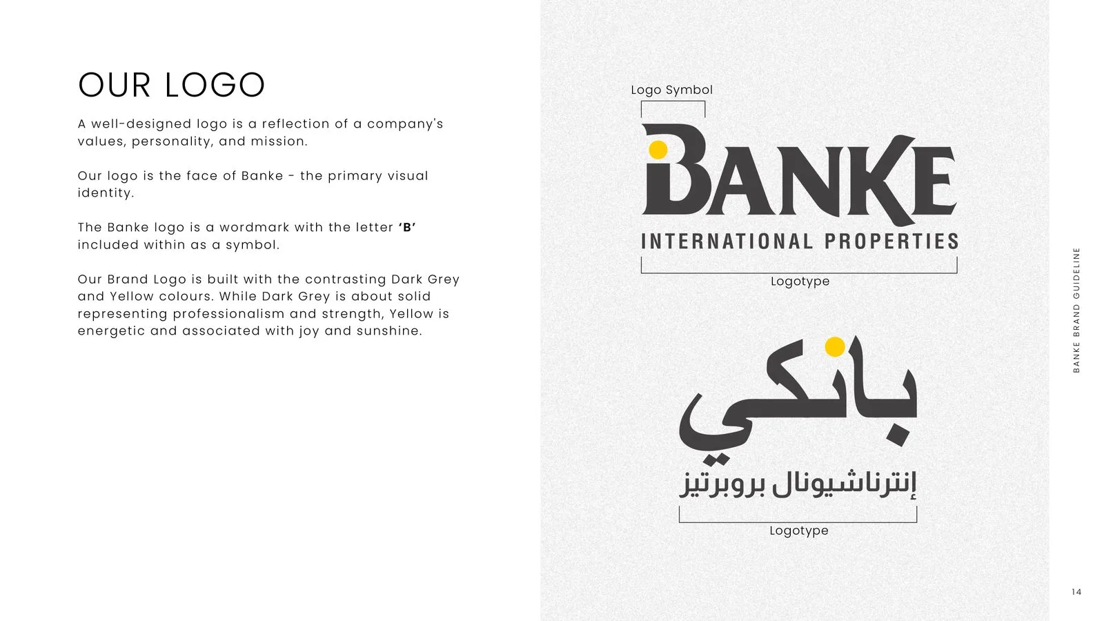
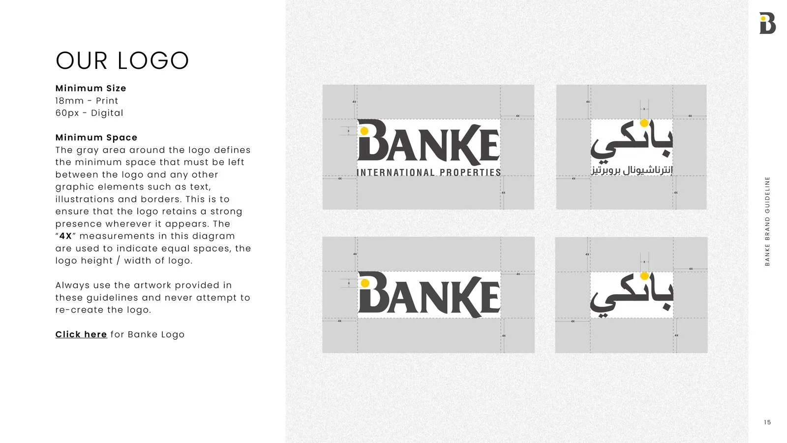
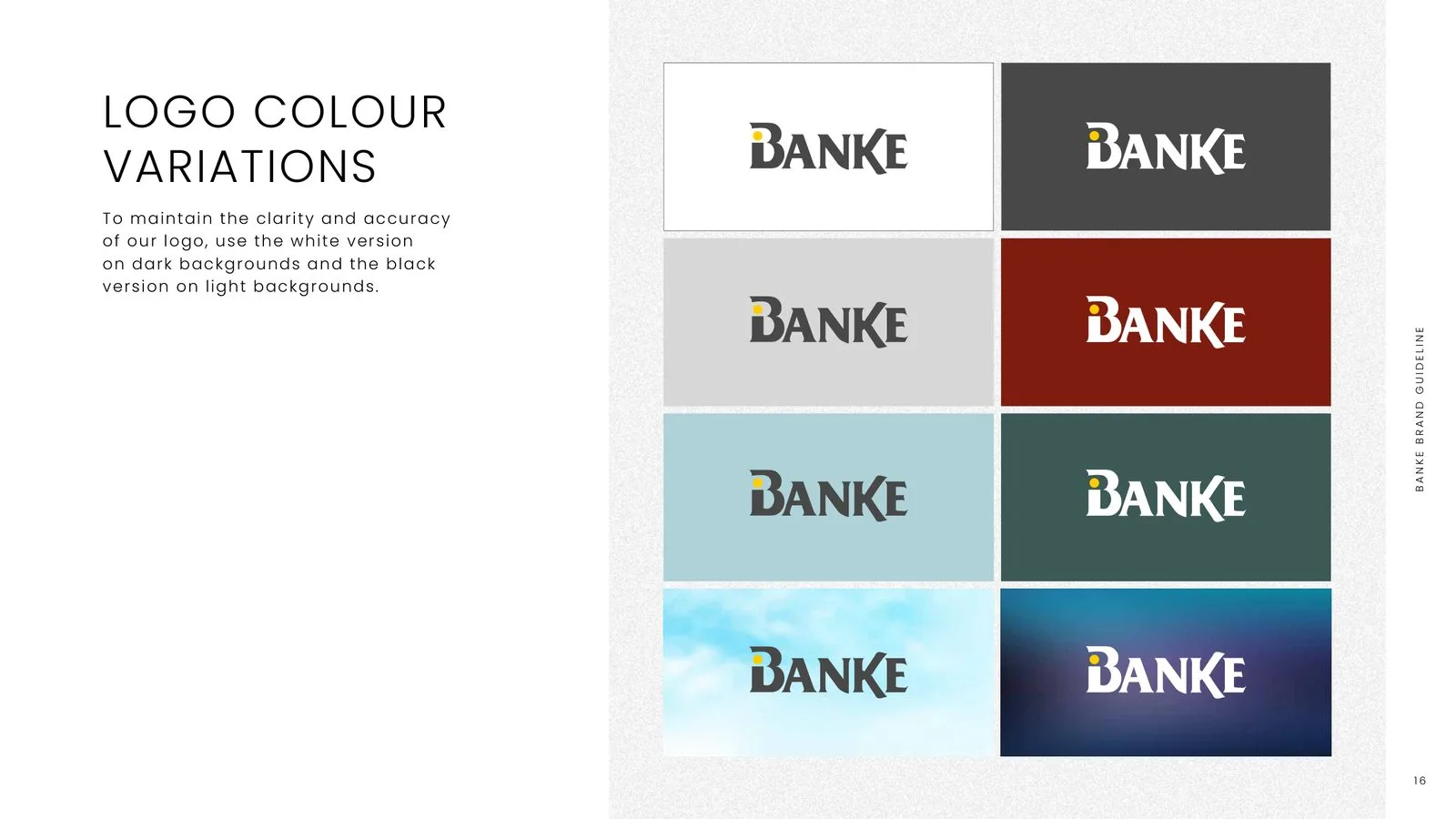
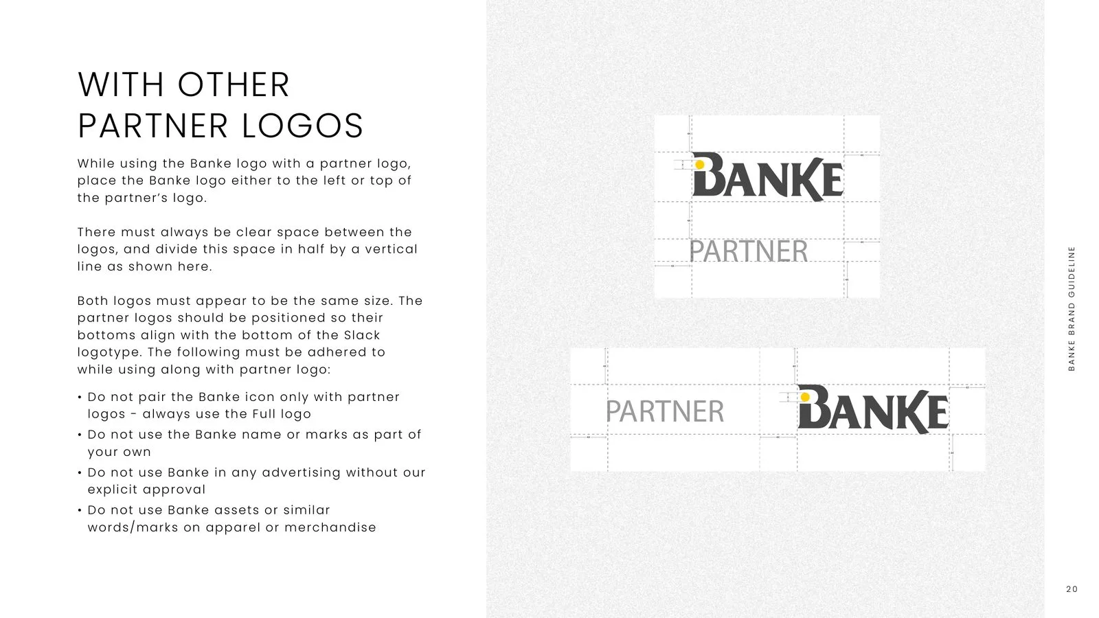
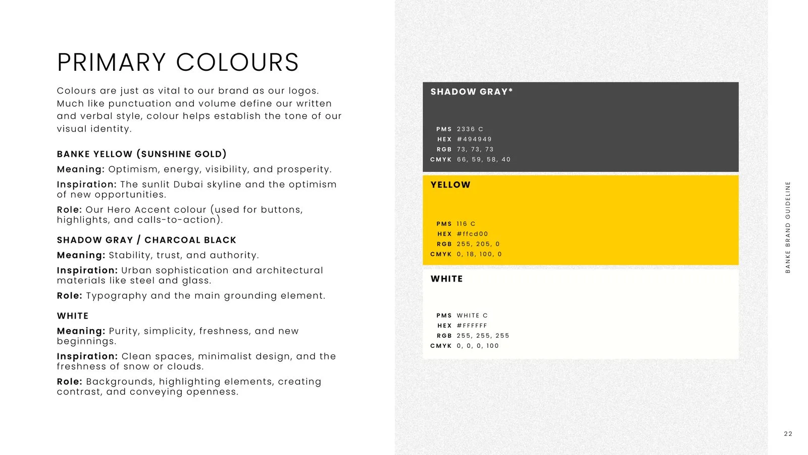
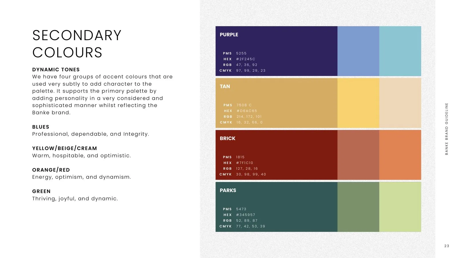
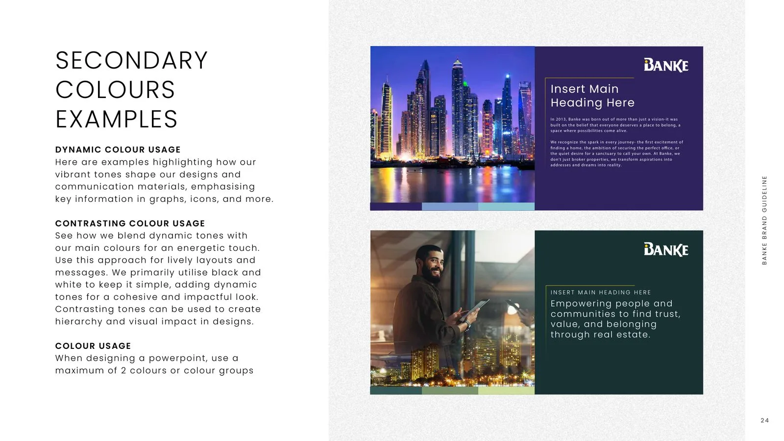
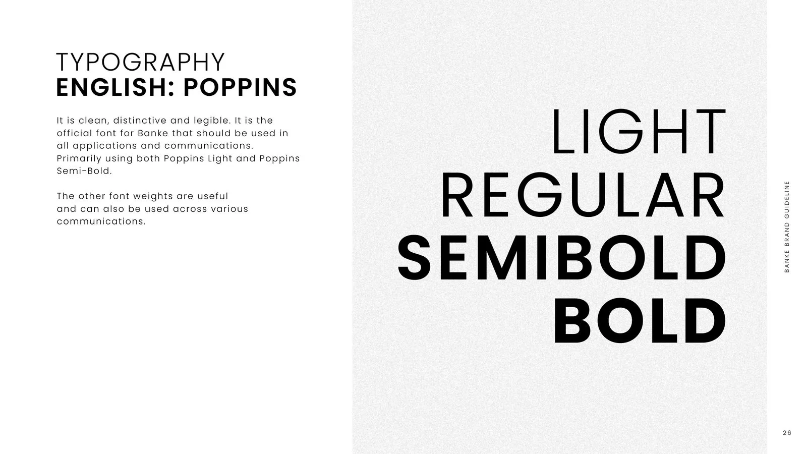
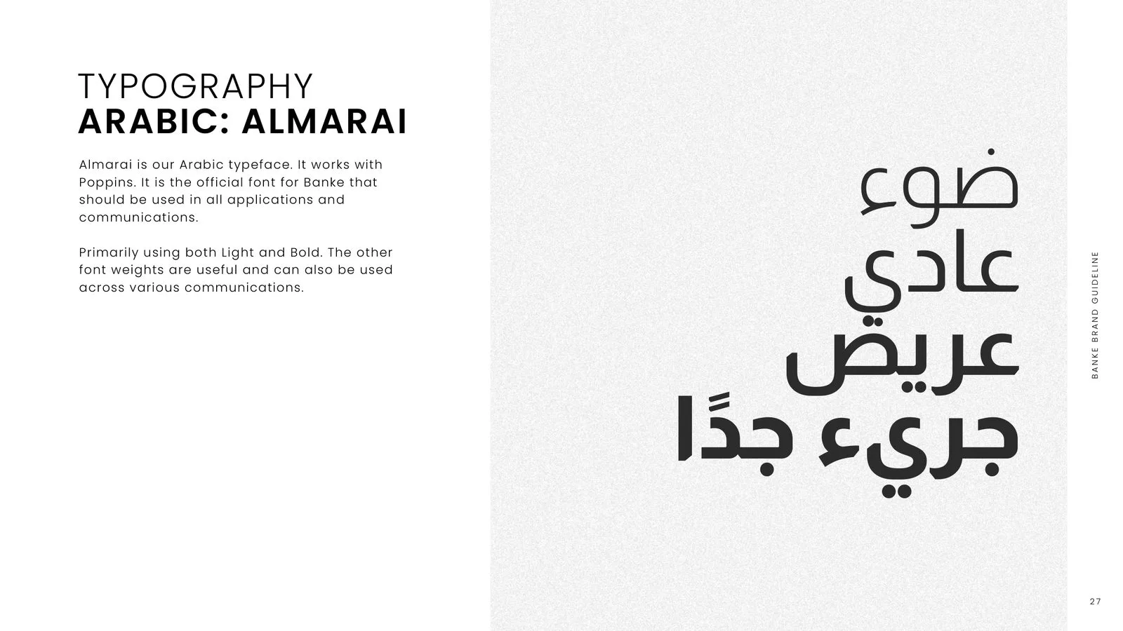
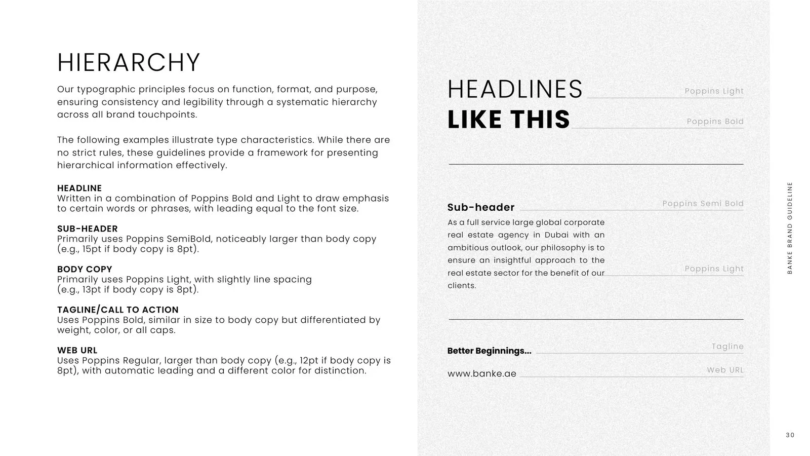
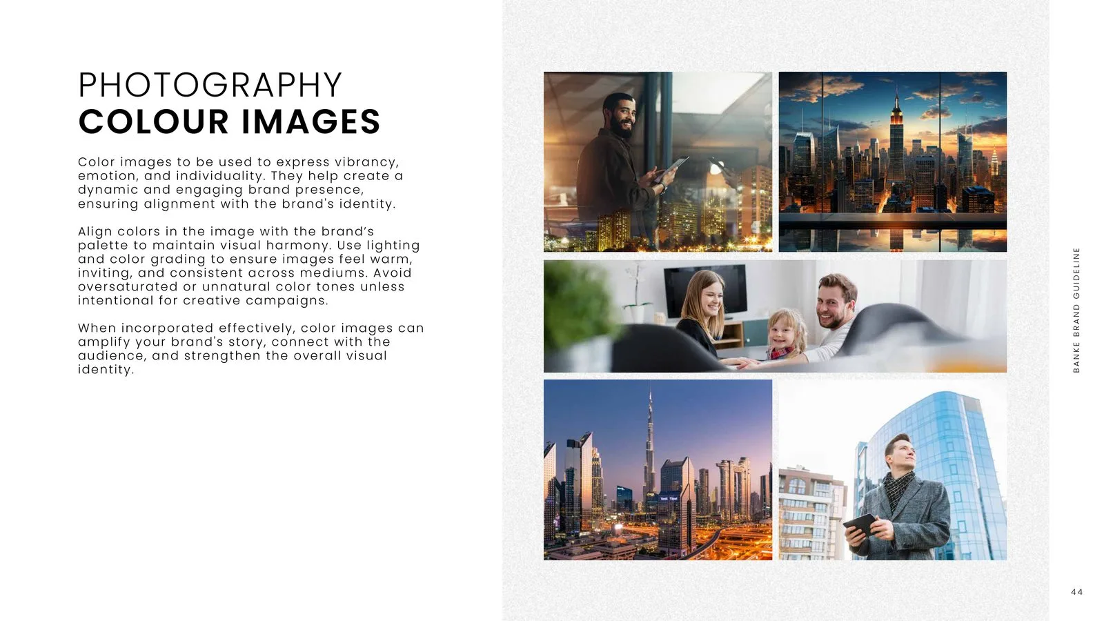
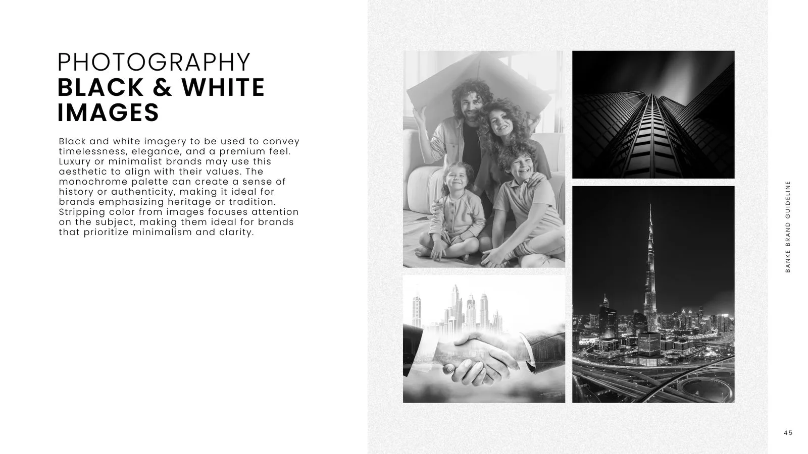
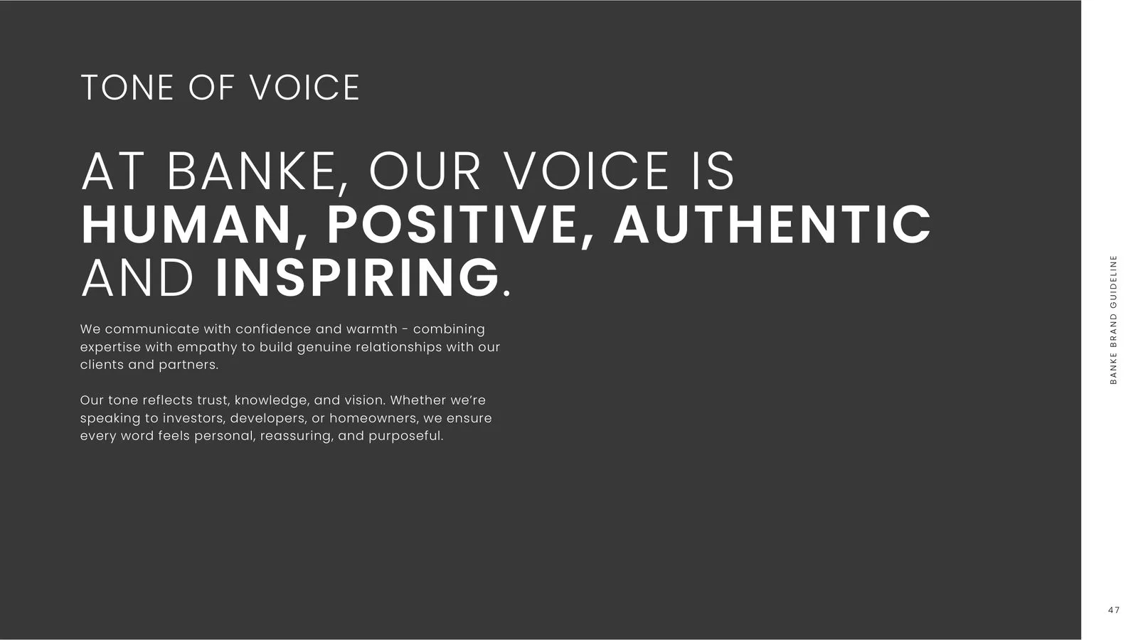
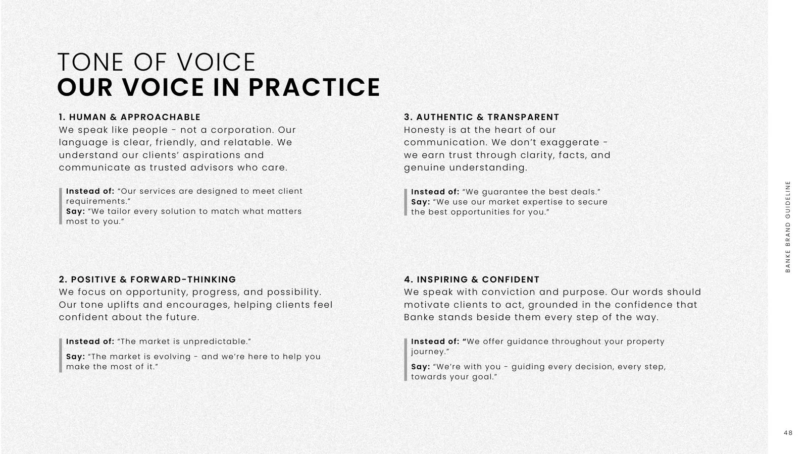
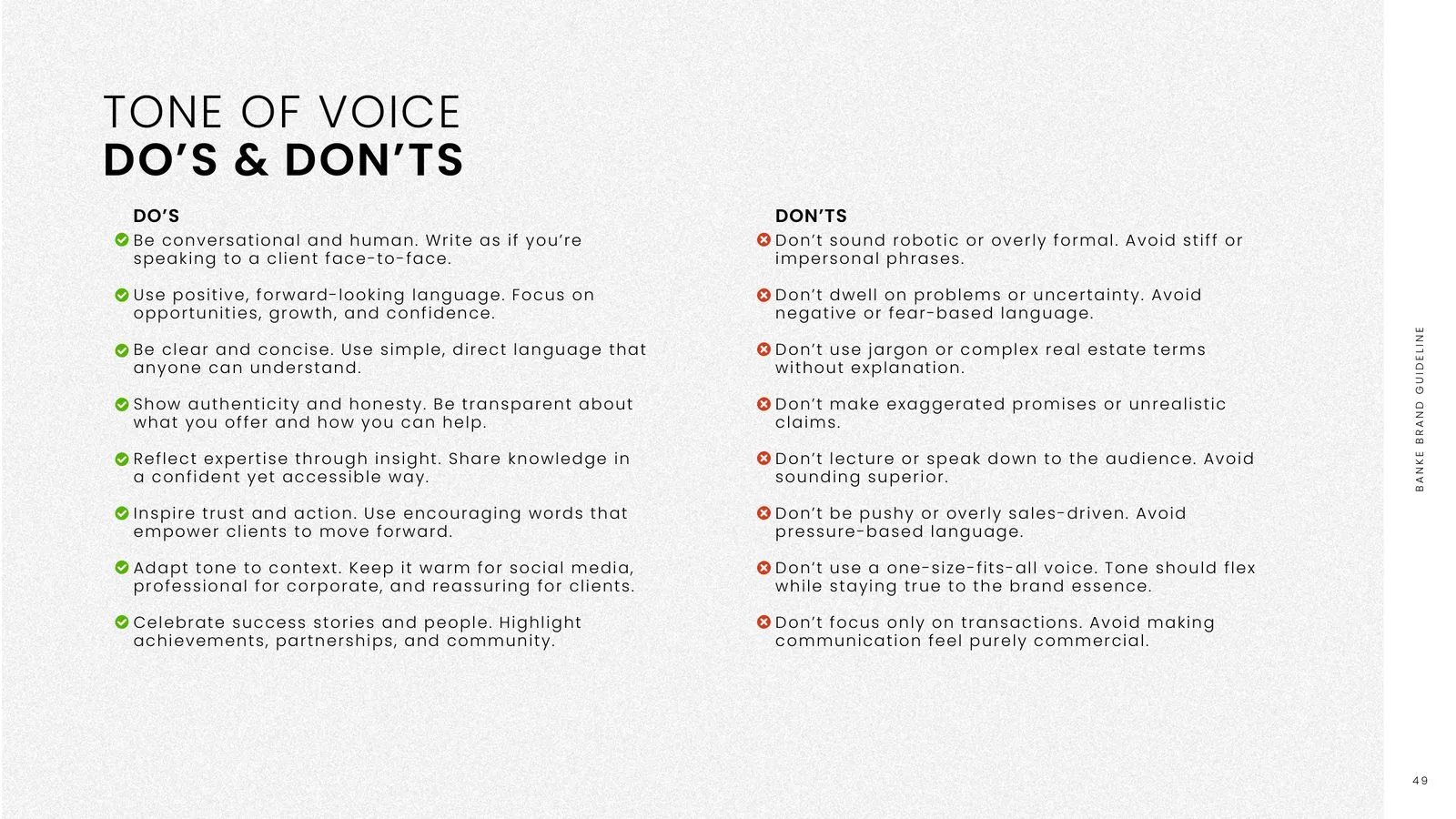
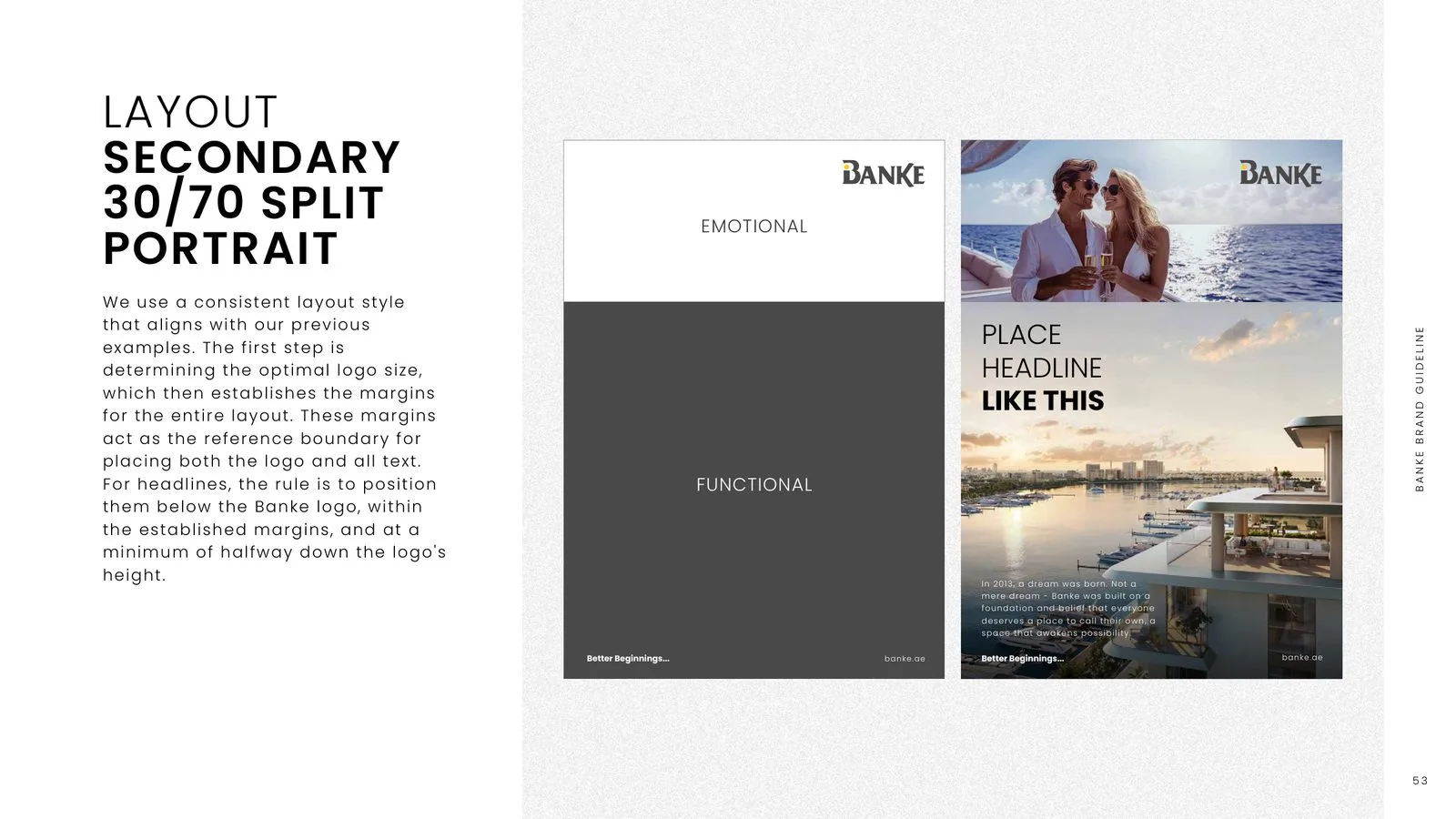
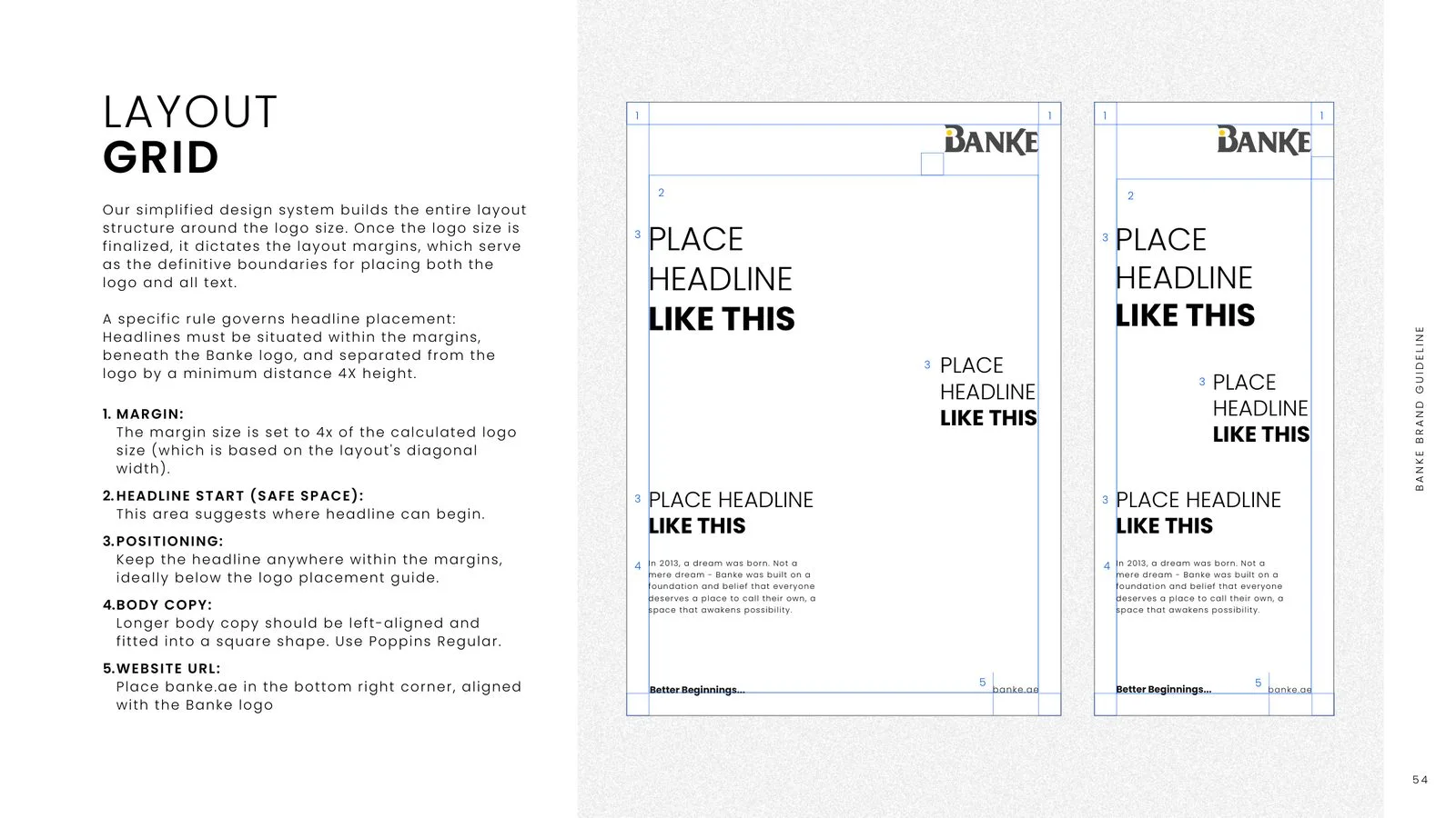
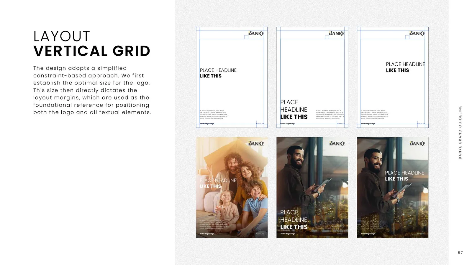
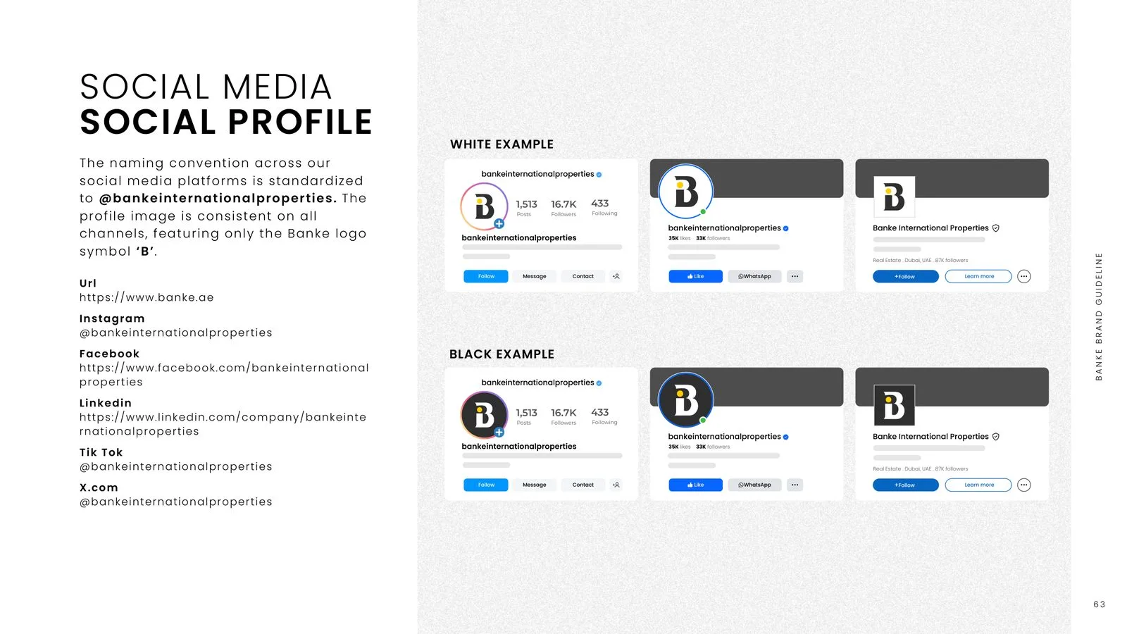
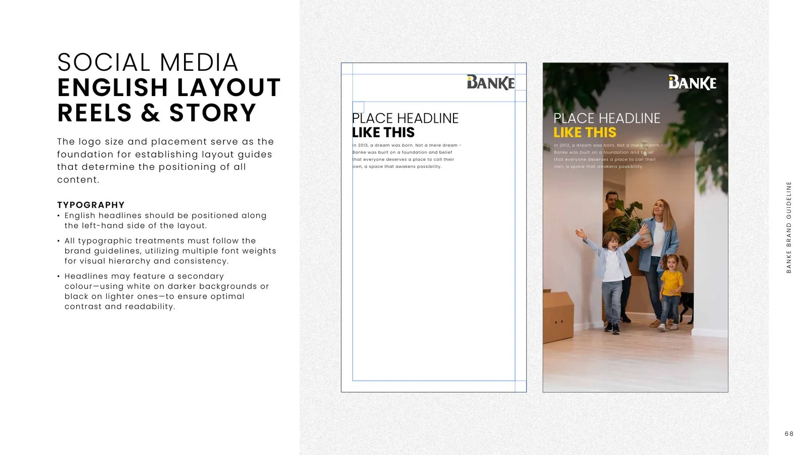
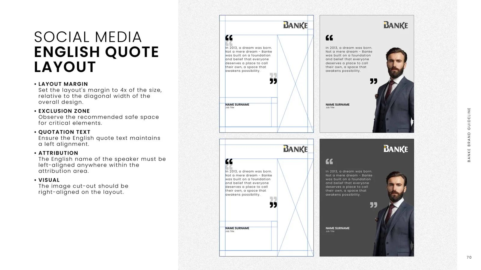
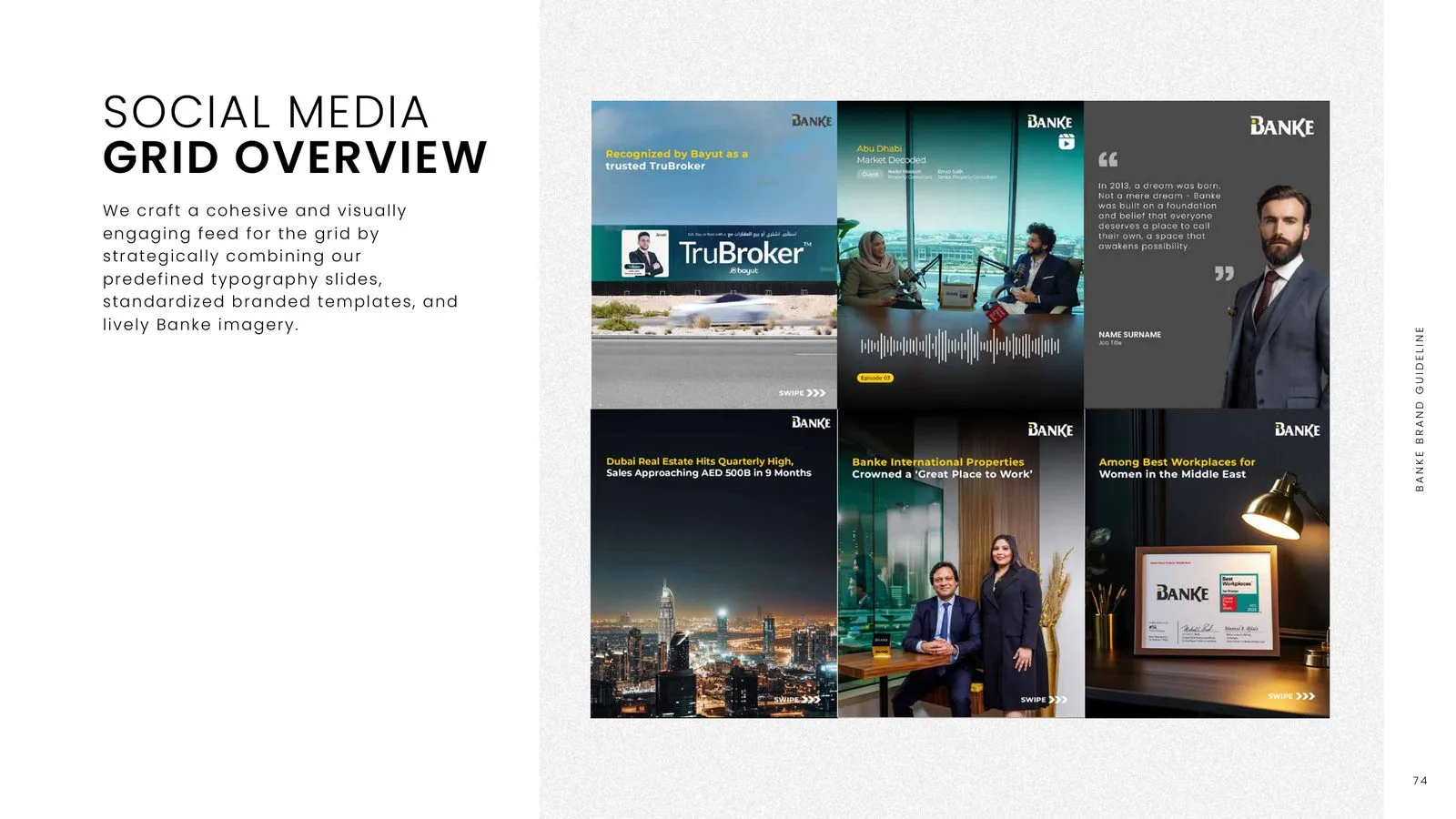
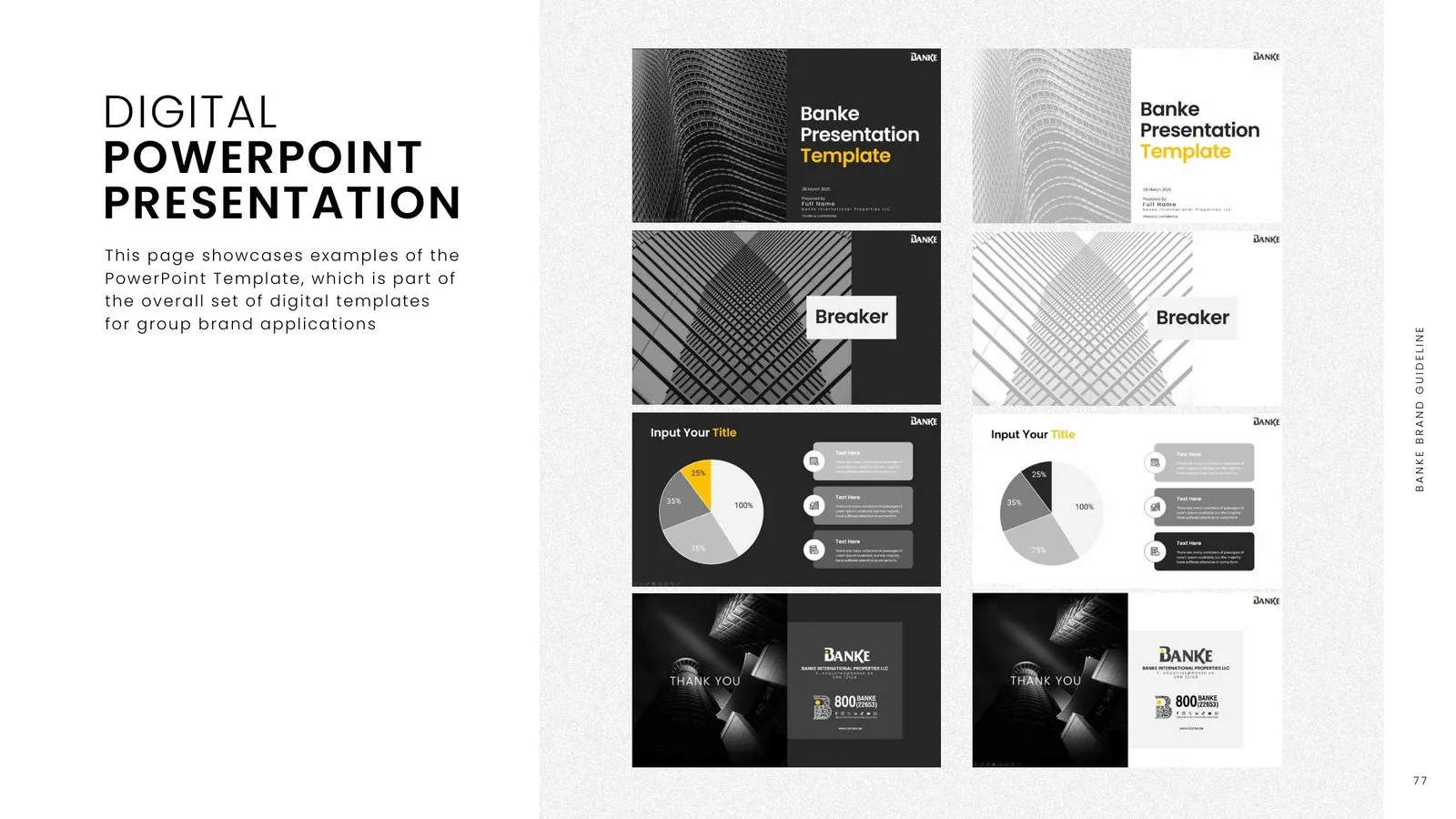
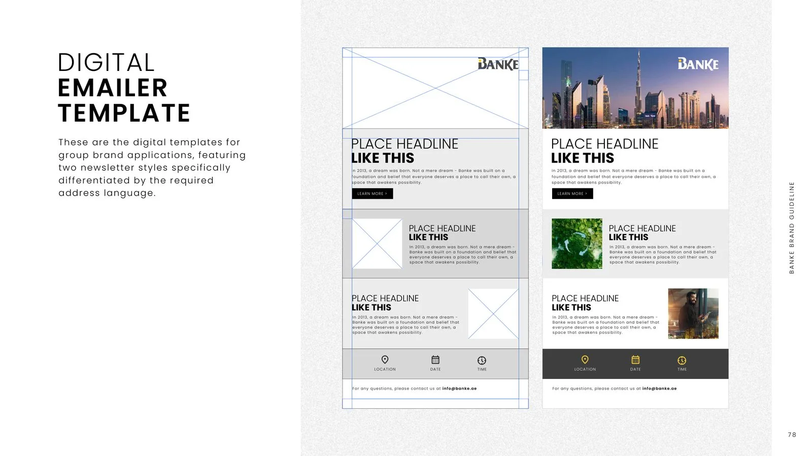
The name draws on three roots: the Italian banca, the exchange table of Milan’s merchants; the Arabic word for bank; and Banke Bihari, a name of Lord Krishna. The wordmark sets a B inside the name as its symbol, in dark grey with a sunshine-yellow dot. Banke Yellow, Shadow Gray and white lead the palette, with four groups of supporting tones, and Poppins pairs with Almarai for English and Arabic. The guide then covers photography, tone of voice, layout grids, social media templates, presentations, emailers, stationery, co-branding with developers, event flags, a backdrop, a kiosk and merchandise.
- Brand guidelines
- Brand strategy
- Visual identity
- Social media templates
- Stationery
- Events & merchandise
#FFCD00#494949#FFFFFF- AaPoppinsEnglish text
- AaAlmaraiArabic text
Brand Strategy
8 images
Visual Identity
14 images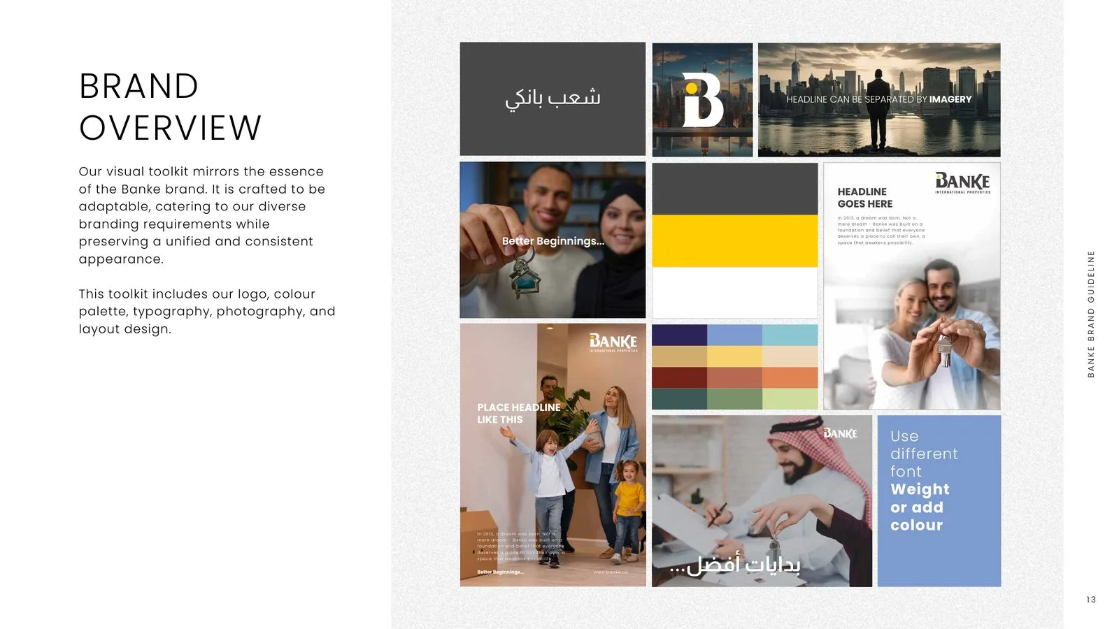
Photography & Tone of Voice
6 images
Layouts & Digital
10 images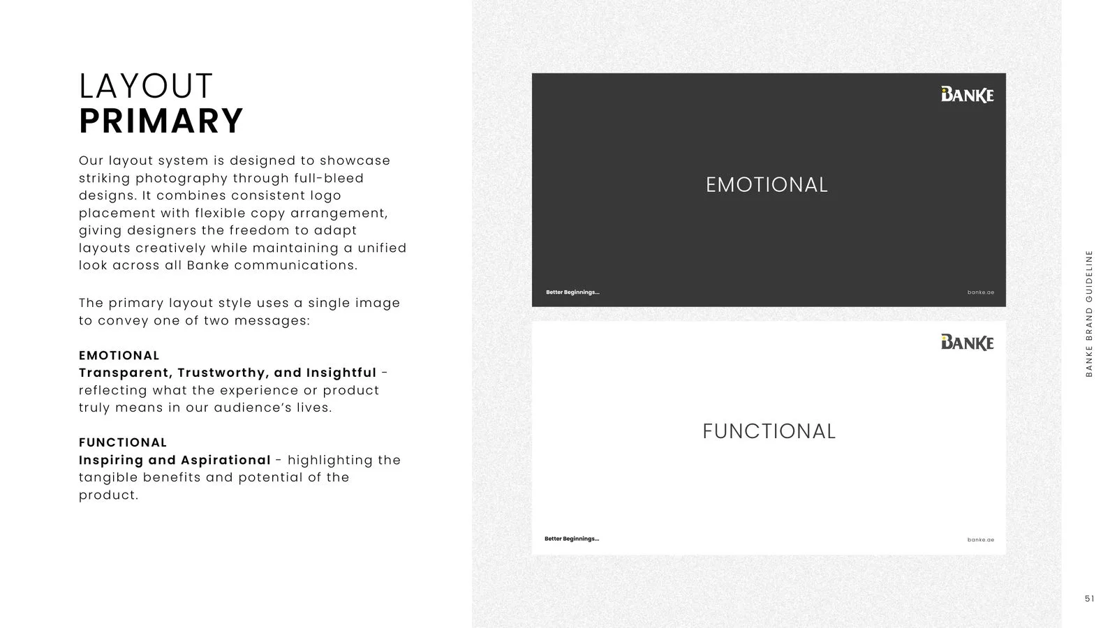
Brand in Action
10 images