
Bengaluru Agro Proteins
Corporate identity for a poultry meal and oil producer supplying local and international markets.

The brief
Bengaluru Agro Proteins produces poultry meal and poultry oil for local and export markets. The brand needed to signal quality, hygiene and reliability to business buyers while staying approachable. The 57-page brand book covers the brand story and purpose, a promise of “uncompromising quality, every time”, an Explorer archetype and a positioning built on premium quality and global reach.
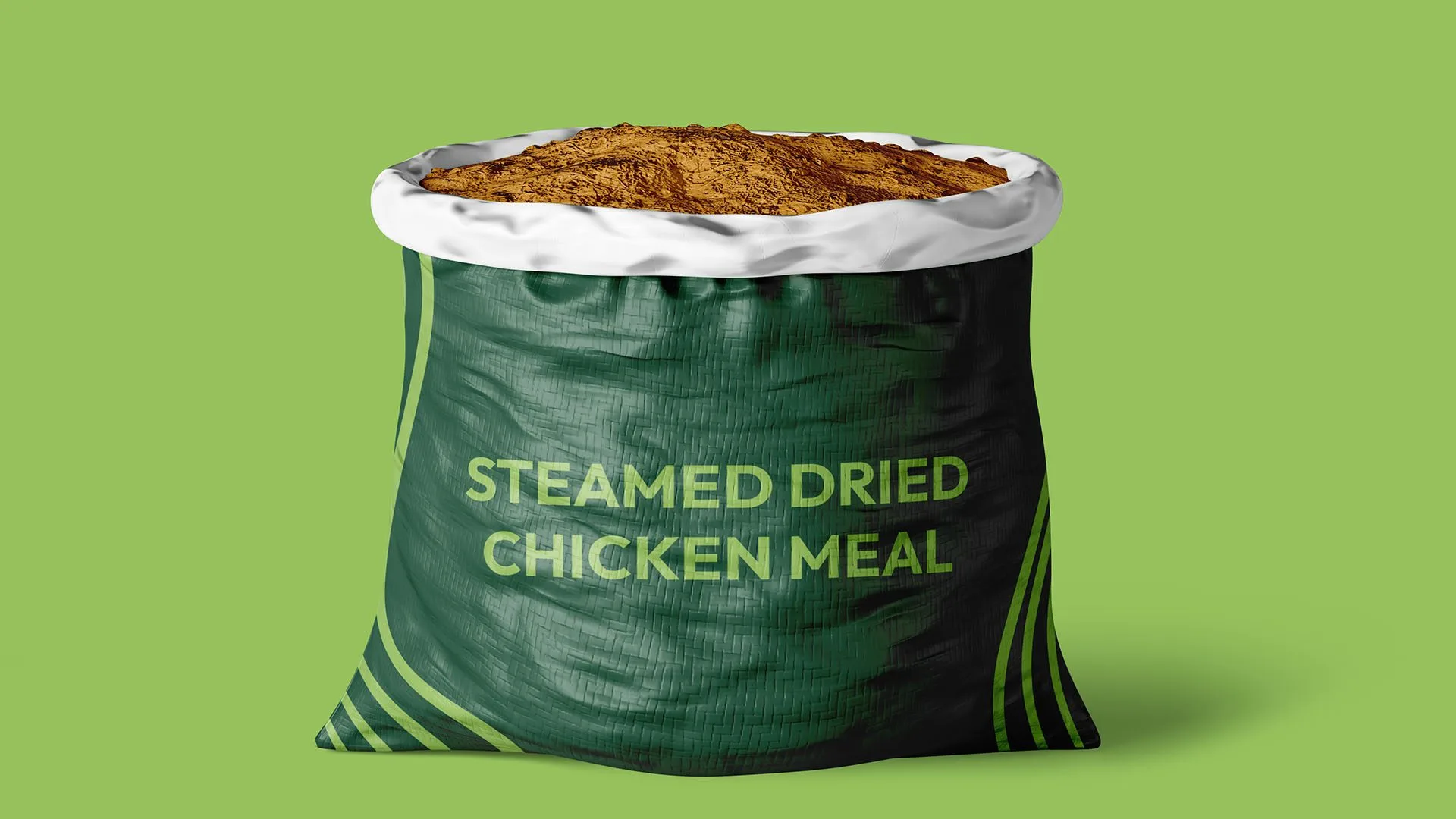
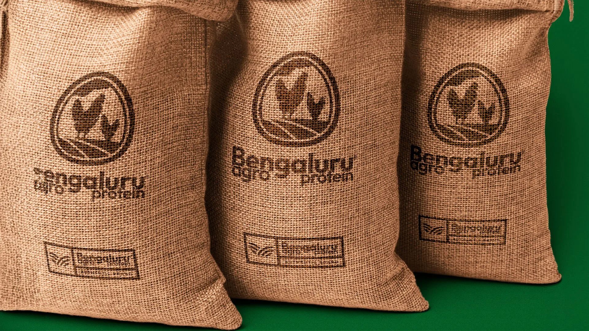
The mark places rooster and hen silhouettes inside an egg-shaped outline above rolling farmland, with the wordmark set beside it. Forest green, leaf green and linen form the palette, with Outfit for headings and text and Poppins Italic for callouts. The farmland lines become a brand pattern, applied to polo shirts, ID cards, feather flags, business cards, oil cans and bottles, feed sacks, cartons and a shipping container.
- Brand strategy
- Logo
- Brand guidelines
- Packaging
- Corporate merchandise
- Event graphics
#174532#96C15C#FDF0E0- AaOutfitHeadings & body
- AaPoppins ItalicCallouts
Brand Strategy
11 images









Visual Identity
11 images










Tone of Voice
1 image
Brand in Action
14 images